Retaking for the Archive: Capturing the Presence of a Painting

Emmanuelle Capatos at the Ny Carlsberg Glyptotek in 2026. So far Symposium has traveled to cities in Scotland, England, Denmark, France, Italy, Greece, and more, in search of collecting high resolution images of great paintings when none can be found already available.
Emmanuelle, co-founder of Symposium, is a professional artist who has been photographing her own work for years. Additionally, before her transition to painting, she had completed Harvard’s Digital Photography Course with Harvard Extension School instructor Dan Armendariz in 2018. Later, during her theatre studies at Bristol University, she was a part of student film productions where she continued to work with cameras.
Photographing paintings for the art market requires a certain level of accuracy: the images must be an honest representation of the work for buyers, high enough resolution for competitions and galleries, and attempt to capture the presence of the painting for international audiences.
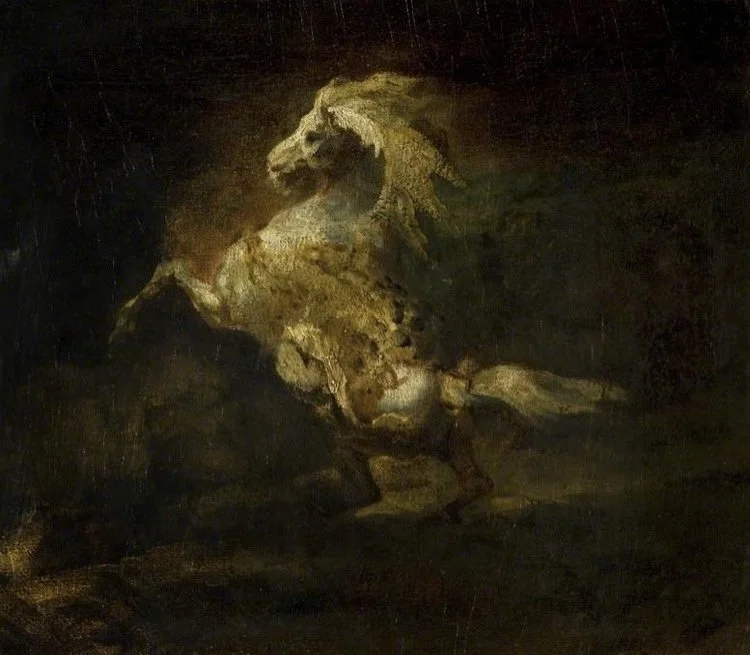
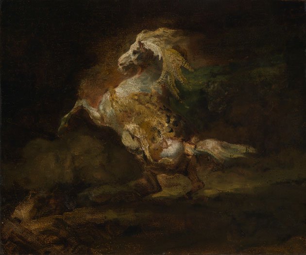
A Prancing Grey Horse, Théodore Géricault, 1812, Oil on canvas, 45.1 x 54.6 cm, Collection: Burrell Collection, Scotland
Some paintings may be undergoing to ongoing conservation efforts or held in archives inaccessible to the public. In such cases, Symposium contacts the relevant institutions for help. On the left is the available digital copy, on the right is the more accurate copy provided to Symposium from the Burrell Museum and the Glasgow Museums Collection.
However, if a high quality digital copy is lacking, personally retaking for Symposium’s archive is preferable for the control and accuracy it ensures we can achieve.
~
So how do you capture the sensitivity of a painting in a photograph?
Of course, looking at a photo of a great painting will almost never capture its presence when standing in front of it. However, there are multiple factors that affect how a photo feels to look at, and we can use those to at least echo the clarity of a painting.
The first and most obvious is getting a good quality photo through gear and setup.
Setup
Tripod: Using a tripod gives greater control when taking photos and significantly reduces motion blur
Camera: A DSLR camera is the standard high quality camera to use for photographing paintings. More affordable DSLRs have APS-C sensors, but if the painting is monumental in size and you can afford it, a full frame sensor is the best.
Lens: Make sure the lens is not too short (not below 35-50mm), as this might cause a slight fish-eye effect. That distortion can be corrected in post production, but the goal is to minimize editing as much as possible.
Additionally, prime lenses (lenses with a single fixed focal length) are better than zoom lenses.
Lens filter: A polarizing filter can be useful to avoid capturing glare on the painting (or in Symposium’s case, reflections in glass covering museum paintings). However, it’s not essential, as techniques like taking the photo at a slight angle can help work around glare.
Lighting:
Lighting should be
even across the painting
in the same direction as light depicted in the painting. If you’ve painted a portrait with the light hitting the face from the top left, the light hitting the painting when being photographed should come from the top left as well.
And/or, in the same direction of light the painting was created in. The direction and thickness of the brushstrokes affect how much light reflects off them. If you painted an area to be brighter using the quality of the brushstroke, it might not be as bright in a different lighting.
Often the most beautiful lighting to photograph a painting in is natural daylight, but artificial light that mimics daylight can work too, as long as the above applies.
Settings
If you’ve never worked a camera, there is some basic terminology you need to know. There are three main ways to get a photo exposed well, but each of these settings has a catch.
Shutter Speed:
Shown as a fraction representing how long of a second the camera sensor is exposed to light for.
The larger the fraction is, the more time the sensor is exposed for, and therefore the brighter the photo will be
The Catch: the more time the sensor is exposed for, the more likely motion blur will affect the image.
Aperture:
Shown as a number usually increasing in 0.4 increments, showing how wide the opening of the lens is.
The smaller the aperture, the larger the opening, and the brighter the image.
The Catch: the larger the aperture, the shallower the depth of field (and thus the more focal blur in the photo).
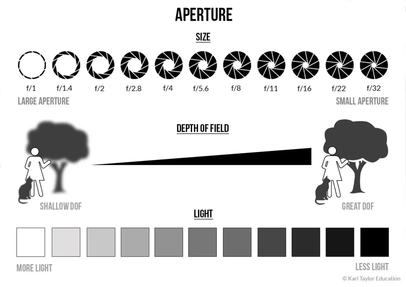
Visual Education. “What Is Aperture? Aperture Infographic.” Aperture & Depth of Field, Visual Education, https://visualeducation.com/photography-course/aperture-depth-of-field/.
ISO:
Shown as a number increasing in increments of 100, representing how the sensitivity of each pixel. Think of this as similar to the mouse sensitivity setting on your computer. Set it high, and the mouse jumps at the smallest touch; likewise, a high ISO will make each pixel react extremely sensitively to any light.
The higher the ISO, the brighter the image
The Catch: the more sensitive the pixels, the more likely they are the create distortions. In photography, this distortion is called noise.

On the left, an photo taken with a high ISO and noise level, on the right, a photo take with a low ISO.
To take photos of paintings, you ideally want to make sure:
the painting is well lit
your shutter speed is high enough to have no motion blur
your aperture is high enough to have the picture totally in focus (which shouldn’t be too hard if the painting is perpendicular to the camera)
your ISO is as low as it can be while keeping the photo well exposed
All of the above will ensure a high quality photo. Even so, the raw image from the camera is seldom accurate to the painting it’s capturing. So what do we change to try capture a true sense of an artwork?
Post Production:
Capturing the sensitivity of a painting
Artists who have made master copies before know that it’s not only about getting accurate proportions, but about mimicking the path the eye follows when first meeting the painting, and the subtleties of the original painting’s qualities.
Making a master copy is about learning the mentality of the painter who made it, and not at all about producing a spitting replica. However, looking at the subtle differences here is a useful example on picking up on small differences a camera may produce.

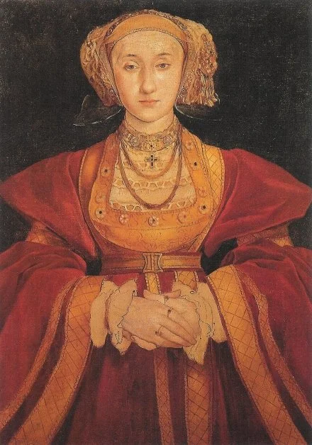
Above is the beautiful painting of Anne de Clèves by Hans Holbein the Younger on the left, and a copy of it made by Edgar Degas 320 years later on the right. They might look quite similar at first glance, but the changes that Degar made are in fact overt and intentional.
When you look at them, does one feel more solid, the other illustrative? Does one woman have a different demeanour than the other? Do they both seem to be the same age?
Notice how the veil in Holbein’s is more defined and opaque, and her face softer. Notice how in Degas’ the highlights of her face have been heightened, while the white of her chest cloth has been quietened, and the outline of her sleeve ruffles hardened. All of these subtle differences make the paintings feel different, and likewise when cameras make small changes to a painting’s appearance, it strongly affects the presence conveyed.


Cameras pick up on things the human eye doesn’t. The warmth of the light on the painting, the white balance of the camera, and the specific colour sensitivity of the camera’s sensor can all make the photo feel different. Some camera sensors heighten contrast, others soften it. The above is a painting I did in 2024, the one on the left is taken with a Canon 90D, the right the Fuji TX-20. Both are the raw images.
The warmth of the Canon is the most obvious difference, but other than that, what differences do you feel? Do they have a different presence? Do they feel like they were make in different time periods?
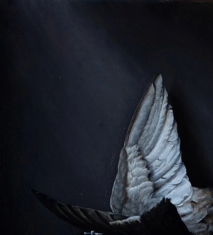

The Canon is not only far superior in terms of resolution, but the depth and subtlety of its shadows and value transitions. The Fuji tends to have a higher, sharper contrast.
Look at the beam of light hitting the wall behind the wing: notice how it’s brighter and more patchy in the Fuji shot. However, because of the different colour sensitivities, notice how the soft small brown grey feathers along the top ridge of the wing has higher contrast in the Canon compared to the silver feathers adjacent.
I found the Canon still needed editing to capture what I was seeing in life. Admittedly, I actually think the warmer tones of the photo are more beautiful than the grey I painted, which is a useful note for next time. But the painting was not that warm, and could still use a slight boost of contrast to mimic the silvery effect of the feathers. Additionally, it had picked up on dust particles far more than my eye was seeing.
Funny enough, there have been some rougher paintings I’ve done, which the Canon seems to smooth too much — in that case I might try the Fuji.
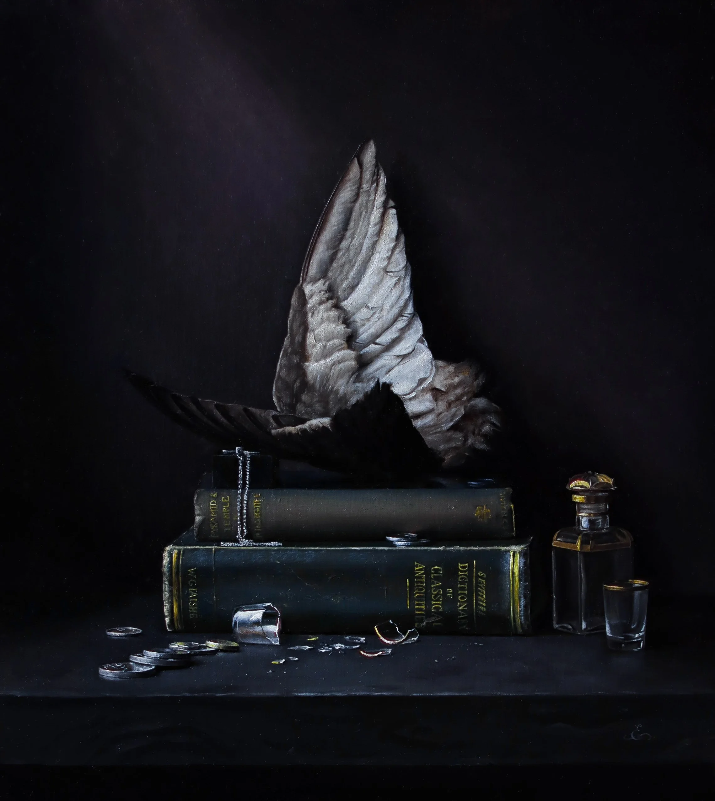
The final edit: The Fall, Emmanuelle Capatos, 40 × 45.6cm, Oil on panel, 2024, Collection: Private Collection
When comparing your painting to your your photo, ask yourself:
What does my eye notice first when I look at the painting?
Does light that catches my eye in the painting seem as strong in the photo?
Are there elements in the photo that I don’t notice at all in the painting?
Is there anything in the photo that is distracting me? Dust particles, dark patches etc.?
Are transitions as subtle or as strong in the photo as the painting?
Does the photo feel the same as the painting?
The utmost sensitivity was what essential in creating great paintings, and the same sensitivity should be used to convey them. This is what Symposium strives to achieve in our archive catalogue.
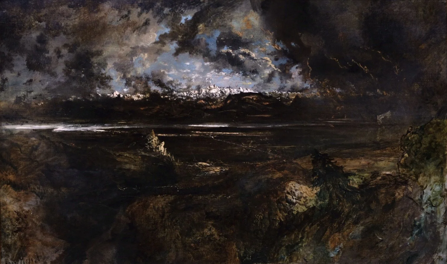
Symposium’s photograph of Théodore Rousseau’s ‘Mont Blanc seen from La Faucille, Storm Effect’
Théodore Rousseau, Mont Blanc seen from La Faucille, Storm Effect, 1834, Oil on canvas expansive, 143 × 240 cm, Collection : Ny Carlsberg Glyptotek in Copenhagen
